|
I put a lot of efforst in to this project. What we had to do was make an ESPN like broadcast of a childrens tricycle race. And what I came up with was this thing that I made. Now how did I do it? Well first of a compiled the clips into one coherant video. Secondly the title which I used keyframes to make it spin and grow, and put it ontop of a freeze frame. Then I just let the video run right until the end where I combined a series of page peels with monochrome to mnake that epic outro, and added rolling credits by clicking a button that said roll. I could go into the niddy griddy but that would take a while. For now, this is good. I am really proud of it, despite James thinking his video is better even when mine is better.
0 Comments
For this activity, I edited a knock knock joke together. This video had to follow something called the 180 Rule. If you don't know what it is look it up or use this not as good description. Basically it states that the camera should go back and forth in a conversation. But it should also follow a line. This line has to make it look like both people on both sides should be on opposite sides. Basically that's it. For this joke I added a little something at the end to spice it up. There is not much else to say.
For this assignment, Mr.B found clips of a random guy on the internet. Of course, it is not as bad as I make it seem. What he wanted us to do was compile these clips into a fluid video with a story and five different kinds of cuts.For my first cut, I did the standard one which you see all of the time and needs no explaining.The second type of cut I used was me changing the perspective, which yes, is a cut. The third cut is a cut on action, which is basically just when the video cuts right as something is happening. Kinda like a punch. Next is a fade, which you probably also see all of the time. It is basically just when the screen fades. Now this last one is called an iris, which may not sound familiar, but trust me, you see it all the time. It is when, in films, at the ending, a black circle grows in the mmiddle to cover the whole screen. Or the opposite can happen. But that was my experience with transitions and cuts.
This is a project that I am proud of, not really proud of because partially of what I am about to talk about was accidental, but first with the non-accidental stuff, the video! (Obviously!!!) This video is themed around somebody making lemonade. This was very similar to our first project in Adobe Premier Pro in that we just made a compilation of a bunch of pictures, except this time we used effects. The effects I used are mainly just intro and outro stuff because it didn't really look well in the middle of the video but as you can see I start out with text moving at the top and with the main picture coming in with an iris circle zoom out. And at the end their is an audio and video fade. Also while doing this I noticed that both audio in video end with an io sound. Now to the semi-accidental part, the synchronization. Somehow, when I added the music it was synchronized perfectly with the cuts. Now why is this semi-accidental, not fully accidental? Well it's because I did some editing to the synchro afterwards, but not much. Also I could've synchronized it by myself. Overall, pretty good.
We have official gotten to the fourth quarter, and you know what that means? New application. This time it is Premier Pro. For this project we had to make a simple slideshow comprised of multiple pictures themed around one color. I chose red. For this project it was simple. For the first part, the title, I used a tool to add text, made it big so it looks like a title. And kamblamo. Then I just added all the pictures to the place at the bottom where you compilate the video. I added music too. I did that the same way I added pictures. Really there is nothing else left t
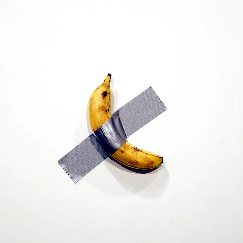
Oh god, the imfamous banana taped to wall. It's crazy how some random guy taped a banana to a wall and sold it for 120,000 dollars. Anyways, I decided to make a poster for said exibit in an attempt to net myself my own 120,000 dollars, and this is the final product. First step is first, adding the depth to the banana. I just duplicated a thinner banana cresent shape and made said duplicate darker. Another part about this that I am very proud about is the sploches. These sploches were made with translucent brown sploches, and the ones that are cut off are from the shape builder tool, and moved over to the side so it doesn't overlap with the outlline. Now that is the main banana. How did I make the tape. The dark part is supposed to represent the tape lumping over the banana, which was also made with the shape builder tool. The rest of the tape is just a square which was made to have grainy edges with effects.
We only did one 3DS Max thing this entire quarter. But wait wait wait. That's fine. Adobe Illustrator is very fun. It is like be Picasso for babies. At least that is what I feel about it. Maybe I am just good at using it, I don't know. Adobe Illustrator is very fun, and allows me to unleash full on creativity. How about the tools? My favorite tool is the shape builder tool, as it allows you to build all the shapes you need. It is very pivotal for making anything that is not bare bones. My least favorite is the pen tool, but I still use it. It is not actually that bad, but it is also pivatol for making things a bit more detailed. Overall, Illudtrator is very fun and I hope to do it again.
 For this project, we needed to make a movie poster. I chose to make Up. I didn't want to make a person as I am bad at that and will inevitably have to make a person in the next project which I will have four days to complete. So instead of that I made a loan balloon flying there. I know it is pretty bare bones but I didn't know what else to put. I know that the clouds are good looking, it's just I thing called the pen tool. The balloon is the most complex element of this project. First I used a pen tool to make a string. Then I used an elipse tool and altered the bottom. For the balloon tip it is just a triangle with a smoothed top, three black smooth boxes running through it, and a smooth box attached to the bottom. The sun I am really proud of because of the texture. That is all I have to say for this one because there is not much. I could go over the background but it would bore you as it is just a square. Is there anything else I didn't mention? I tried to add texture to the clouds but it didn't work so I just added lines. That is all for this one. Overrall I am very proud of it and like it.
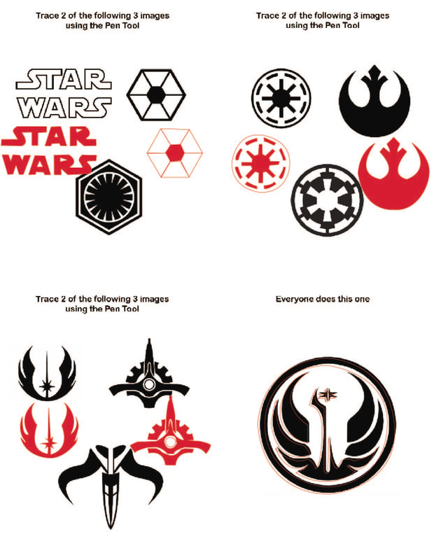 As the title says, this was not pain. Except fopr the last one, we'll get to that. This was similar to the Bezier game, except more advanced shapes, and less procise colorinbg. These were all StarWars themed. For the first one, I just did the logo, and that other thing. The logo and the other thing were pretty simple, especially the the other thing as it was all just straight lines. Then therewas that wheel thing and the Rebel symbol. Those were also both pretty easy and there is not much else to say as they were similar. The next part is where things step up a notch. There were morer curves, shorter and more prescise lines, and more than one line to be drawn. The final one was a pain. For some reason, it wouldn't fill. Second, it is really hard to fill in the circle. So I just left it unfilled. But that was that. I have solidified my learning of the pen tool, and it is ingrained in my mind.
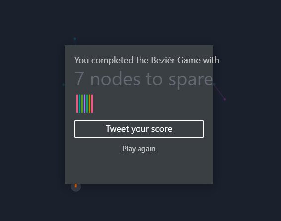 You know it's bad when I use that style of typing with the periods and all that. This was really just pure pain. Why was it pain? What is this game? This is called the Bezier Game (https://bezier.method.ac/ here is the link). It is quite possibly the most painful game I have played yet it is strangly addictive in a weird way. This was supposed to help you learn the pen tool in Adobe Illustrator. Even though the lines are fat, this felt so presice. I was on the edge of my seat the entire time and not in a good way. I hope I never have to play this game again.
|
AuthorWrite something about yourself. No need to be fancy, just an overview. Archives
May 2024
Categories |
 RSS Feed
