For this project I abducted, I mean, borrowed James for filming. This was filming for a fake advertizment that I was making advertising something called the fun bottle. I filmed him and compiled the clips into one beautiful video. I start with an animated title and lower third, which I made with keyframes. Then it cuts to James, who introduces the bottle, nothing new here. Then it cuts to James again, exeplaining what it can do. When he threw it, I wanted to make it as intense as possible, so I ajusted the size, gave it a filter and alpha glow, and bam. I also dowloaded an explosion sound effect for it. He also hits me with it, where the music stops thanks to the razor tool. Why did that sound rude. Then he explains the discount on it, and also how you can kiss with it. Sadly, James wasn't up to kissing it. At the very end, you see him staring intently at the bottle with lots of sound filters and video filters and a reasurring message that he got paid.
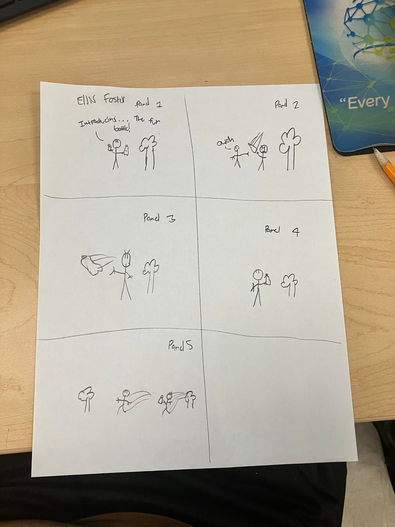
Fun Bottle
Introducing, the fun bottle, a bottle for all your bottley needs.
You can throw it.
*Throws it*
You can hit people with it
*Hits me with it.*
You can even... Don't make me say this...
Say it!!!
You can even make out with it
You can get the bottle for 50% off for 275$.
MENUUUUUUUUUUUUUUUUUUUUUUUUUUUUUUUUUUUUUUUUUU
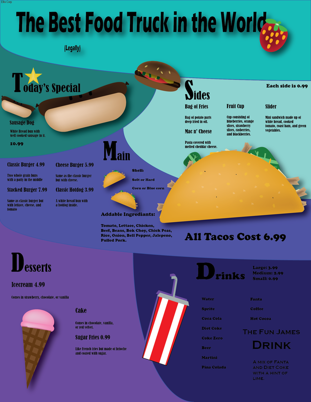
I am very proud of this. There was a lot of time that went into this and that's what I like. All we did was make a menu for a make believe resturaunt. I actually did a food truck. I know, how could I. The main part was the burger. What I did to make that was make an elipse with a square at the bottom and delete all the straggling parts. I then coppied that, reflected it, and shrunk the bottom. I made a rounded edge rectangle for the patty, and green squares of lettuce. For the tomato I just added a circle and gave it seed shapes. For the rest of the items, I will not go into as much detail as the burger is the main attraction despite the taco being the biggest. Speaking of, I made the shell in a very similar fassion. I added some cool texture to it, and made chicken by messing around with the ends of rectangles. For the cheese, I made each individual one unique. And finally for the lettuce. I just messed around with an elipse and used the shape builder tool to make it. For the sausage dog which I came up with I made the bun by warping around with an elipse, and same thing for the sausage. The ice cream is just a bunch of simple shapes to make one good one. That is all notable things to cover. I know I did miss the drink but that is the same case as the ice cream. One last thing is the background which is made up of squares and rectangle s I used the shape builder tool on.
😩😢😭
😅😅😅😪😪😫🥱😴... OKay, enough with the emoji's I am not gonna talk the entire time in emojis, or Mr.B would kill me. But I am one of the lesser users of emojis, what's happenig? Well, this project has been a thorn in my side for a while now, and to get it e=out of my way is half way to liberation. (There still is the lights one.😪) But anyways why have I had this due so long? Well these projects are posted aat the beginning of the year and due at the end, and this period of time at the end of the quarter wwas perfect for doing one. I already have 2 easy(ish) ones done. This one I had a car. I know crazy....But I had to attach the car to a spline to animate it and select a thing to make the car face the direction it is moving in. Then I added bank to make it look like the car was skirting. Finally done....!!!...
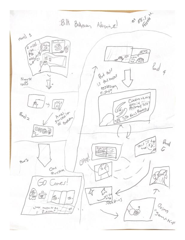
Carolina Canes Commedic Conundrum
This class truley is very fun. And this project reflects it as we get to make our own storyboard, or basically a comic strip. In this one, I tried to make a comedy strip about someone named Billy going into the bathroom, just to find out that it has been vandalized by one certain Canes fan.Billy first thinks that he needs to go pee, so he leaves for the bathroom, just to find out that it is all "Caneified." If that is a word. Probably not but I digress. Wait no not digress, anyways I will shall move on. My favorite part, and the one I am most proud of is the Hurricanes official pregnancy test. I like the 9/10 fans recogment like how toothpast has 9/10 dentists recogment. Also on the back it is supposed to say nutrition facts but that may not be legibal for the average person. Also I know tha pregnancy tests don't have nutrition facts, and that is actually the point. At the end Billy Boi resolves this Human vs Bathroom conflict by blowing it all up, bringing it to the perfect conclusion. Bill has a lot of times where he gets into a conflict with an innaniment object so, yeah.
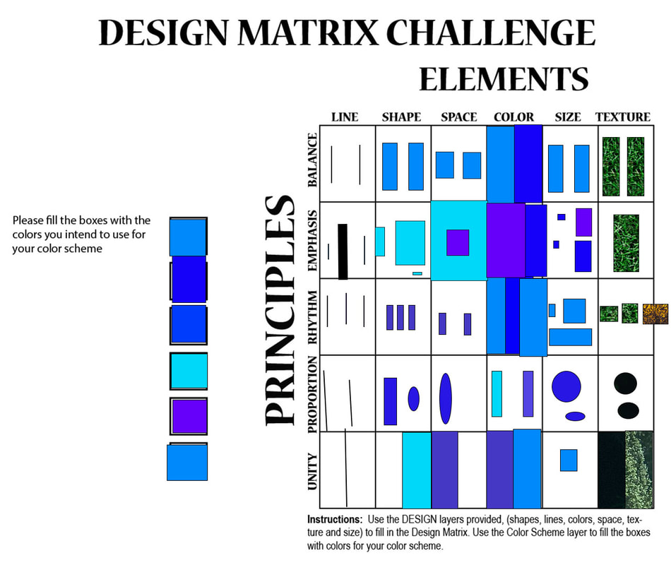
Principles and Elements of Design
For this thing, we needed to combine certain principles with elements of design, which was harder than it sounds. But basically all I had to do was make it so a picture used both the element and the principle. It is really hard to esxplain, you don't know. But basically a good example would be balance and shape, one of the mosst simple ones. I had to make two shapes that were the same size so it fit in to the criteria for balance. But that's all I can really say so yeah. It was a simple, yet somehow complex project at the same time, and I hope I never have to do it again. Maybe because I was tired the whole time and was grumpy so yeah. Anyways, I do need to explain the different principles and elemenets so here is a quick rundown. A line is a long thin thing, and a shape is a 2d thing. Hopefully you know what those are. Space is surrounding the shape and color is how it looks with light reflecting off it. Size is how big it is and texture is what it looks to feel like. Hopfully you know what those are. The principles are more of patterns within the picture instead of something physically in the picture. Balance you should know though because it states that two sides should be equal. Emphasis makes it so one element stands out over the others, and rhythm is just a reallly nice patern. Proportion is the comparison of sizes and unity is similar to balance in that there should be two sides but with different values.
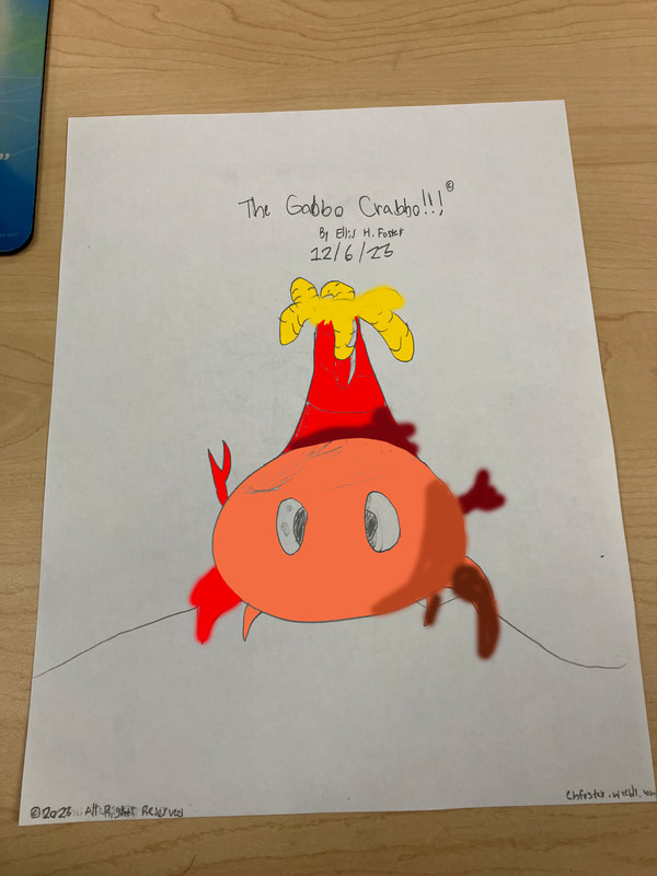
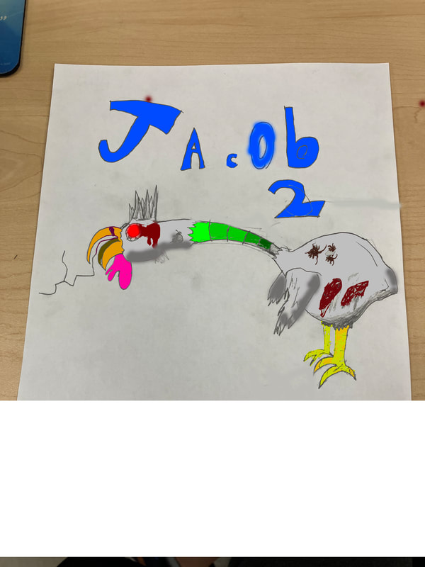
Gabbo the Crabbo and Jacob 2
I really hope I don't get a bad grade on this for my coloring abillities, so I'll try to explain what I was trying to go for for both creatures. For this prokect we had to design a video game character. For the first one I made, what my classmates refered to as a "Dimented Chicken". Like, what the hell!?!?! They are being mean to him just because he looks different. You need to truley dig deep to discover his inner beautiy. First of, his main color is gray. I didn't forget to color most of his body. Just needed to make that clear. Second, the darker parts at the bottom are shaping, also my best shading I've done fort this. His legs are multicolored to also represent shading, and same for his neck. He has wounds from his battles, and cockroaches trying to mess up his color palette. I was trying to go for some old, torn up creature with bloodshot eyes, and I think it worked. Next we have the much cuter, Gabbo the Crabbo, and yes, he is copyrighted. One of his claws is darker than the other because it is fatherback. The shading on top of his head id supposed to be that palm tree volcano things shadow. Not much to say but also one of his legs is hurt. (Far Left) Overall, this is the hardest I could try but the truth is, I am not good at drawing. We did color them in Adobe but my drawing was so bad that adobe didn't recognize it.
Masking and fun and fun
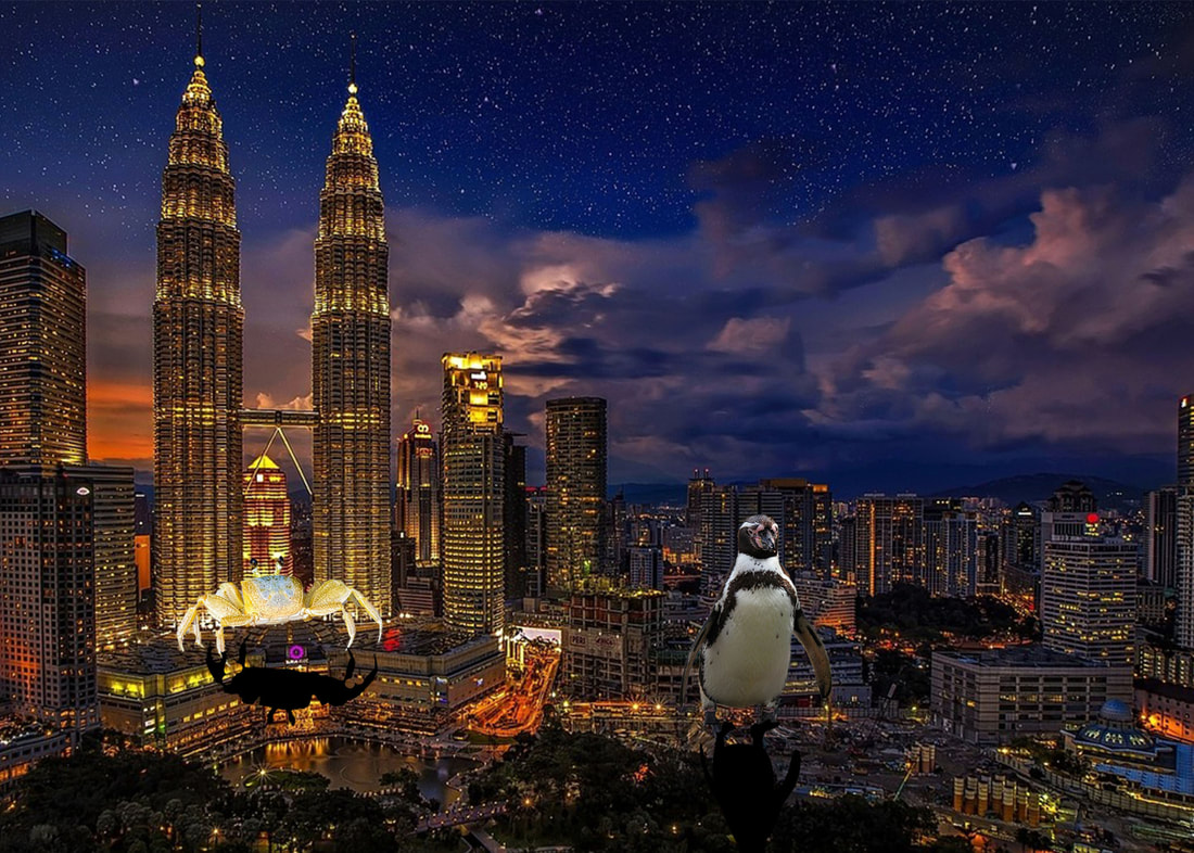
For once in Adobe, I have got the hang of things. And also for once in Adobe, I didn't get off track with Generative AI. Anyways, this was pretty simple. First I chose a background, and the best one I could find that was Royalty Free was this picture of Kuala Lumpur, the capital of Malaysia. I also needed one or more "things" to put in the city. So I chose a Royalty Free crab and a Royalty Free penguin and got to work. Also at first I wanted a flying penguin because the rubrik asks for something humorous, but I couldn't find that. But anyways the theme was giant animals for me. First I added the crab and removed the background by painting over it, until Mr.B exposed the ugly truth about the tutorial and that there is a much easier way. Obviously I wanted to do it that way, so I got to work by first clicking select, then subject, then Voila, bye bye background. Now there were some, lets say, abnormalities, with the background remove so I had to paint over the spots that it missed and repaint the spots that it didn't need to get. So I also did the same for the penguin, and now I have this beautiful easily made masterpeice. Just cause it was easy didn't mean I liked it, but I didn't hate it either.
What did I make (Learning about vignette)
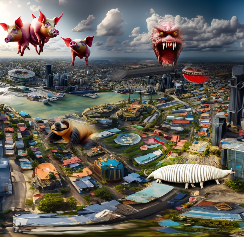
So... Maybe I've been enjoying the generative ai. Maybe too much. I mean, I've always wanted to use it so yeah. Anyways for this project we learned how to to use vignette. First we needed a background, which I chose Arsenal Football Club's home stadium, the Emirates stadium, which I may or may not have expanded using generative AI to make this half paradise, half distopian "thing". I mean, in a way, paradise is distopian if it is too "paradisy" in a way. I mean, just look at Pixar's hit movie, WALL-E. Okay, I am getting way to off track. Kinda like what Mr.B does. So anyways to use the vignette what we needed was feather, something to apply to the selected area to make the piccture almost "fade out in a way." Something we didn't need, however was a layer mask which I didn't seem to understand because I needed to ask for help because I didn't understand what was happening. Kinda like how Mr.B doesn't understand what's happening when a student accidently uses a random keyboard shortcut in 3Ds max. Anyways, again, with the AI generated imagry, it automatically had a layer mask, so that's why I didn't understand. As I am writing this, I had a COVID vaccine yesterday when we had a day of, so I am a bit drowsy so sorry if this CBM PMB isn't thaatdbd gorod dnweijrfnwjgnrwejhkerj...>?{>{*HUIJ
CARrAr
In this project we took the four corners scene and learned to animate it. But wait, I already know how to animate. Yes I do, but this is a new style of animation. Anywho we start by plunking a car and road with spline that we downloaded from Mr.B. Then you go to animation go down to contraints, click path constraint. And voila. To make it 100 million times more realistic, click follow, and optionally bank and set it down a notch. There really isn't much to this so this will probably be my shortest reflection ever yet!!!>!!
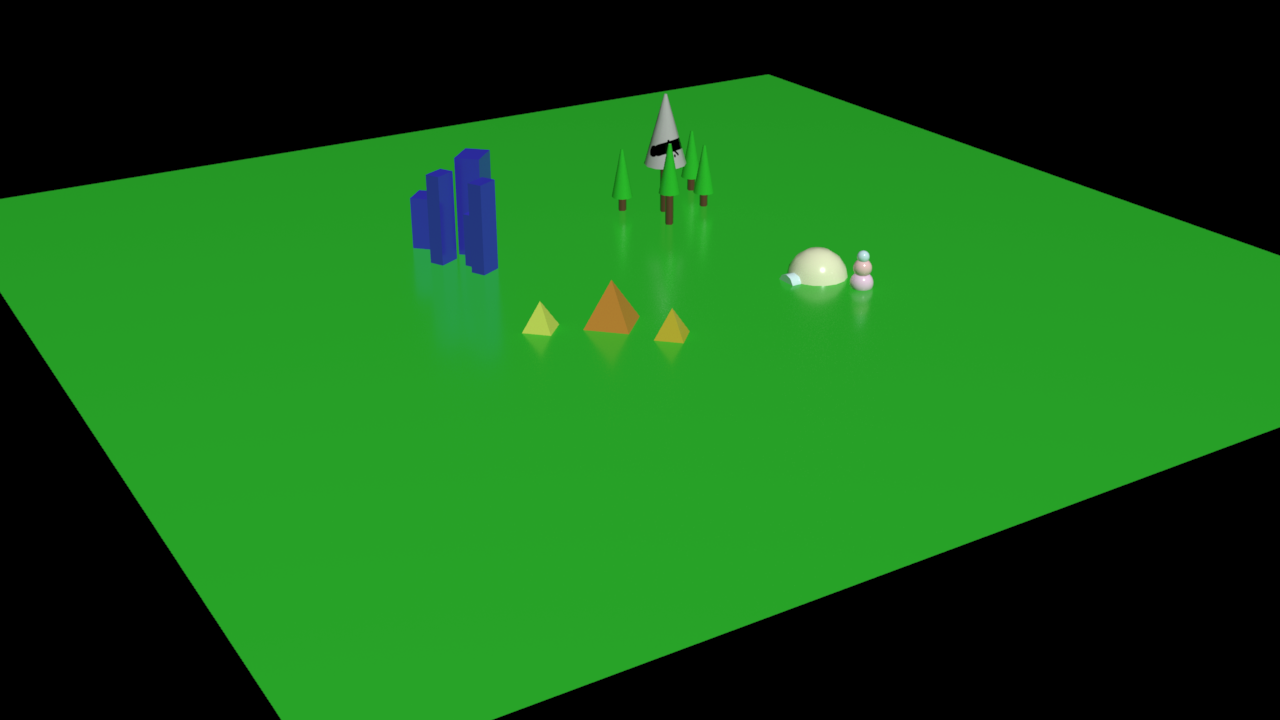
Very Easy Project
You know, I love shapes. And it would be a class 3 misdimeaner if you don't likr them, because they make up our world. In this project we used shapes. Kind of like every single othe project, so yeah. Anyways we make a plain to start. Just a regular plain old plain. Then we put shapes on each corner. For one we put simple boxes to represent the buildings,(Mr.B and I chose the same color!!!1!!) on another side we put pyramids to represent, well, pyramids, another side we put a semisphere with a tube in front, plut different sized balls stacked on top of eachother to make a snowland, and finally cylinders with cones on top to respresent trees. That is literraly all I have to say, thanks for the easy points though.
Very Hard Project
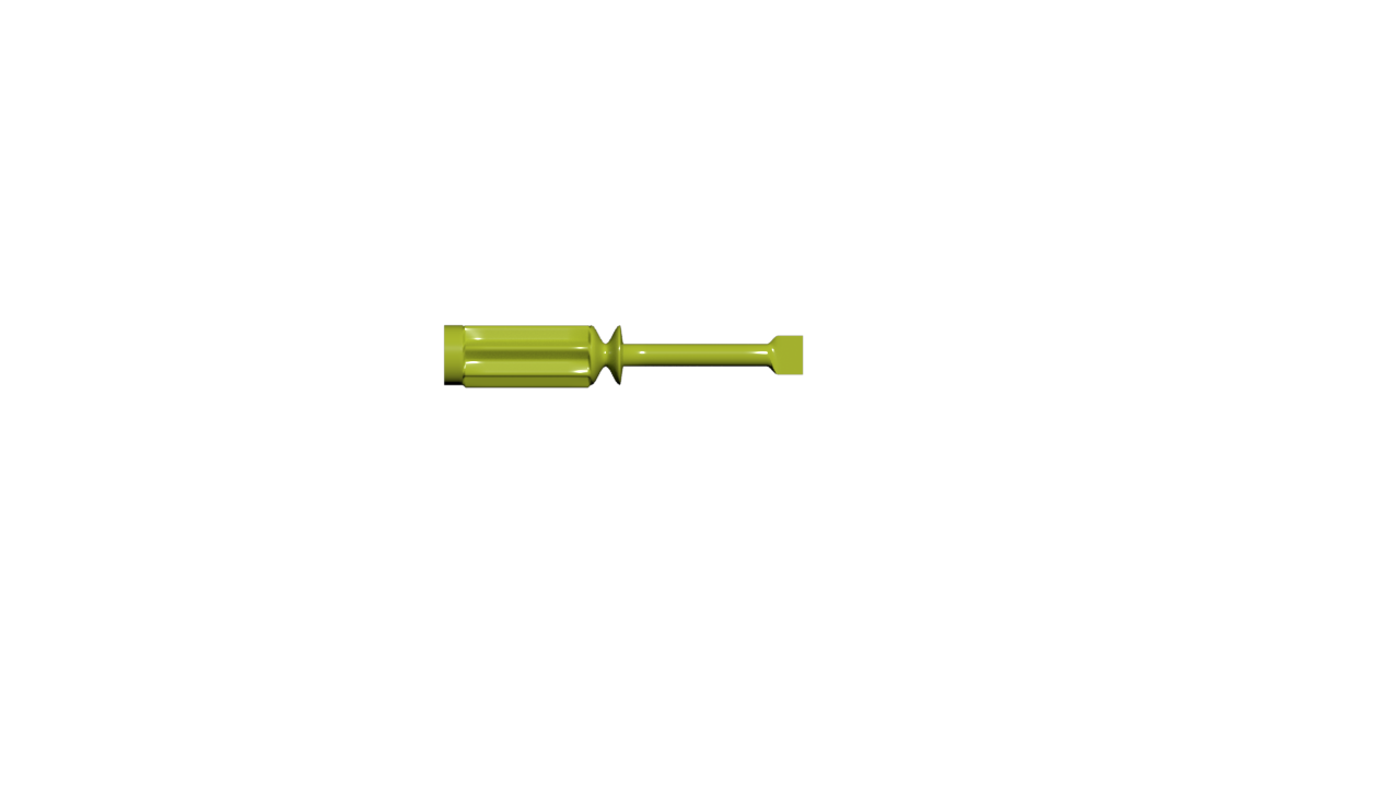
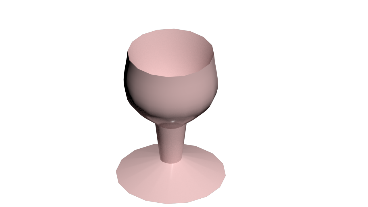
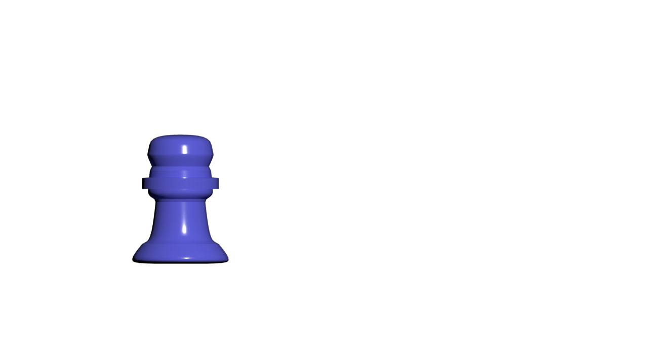
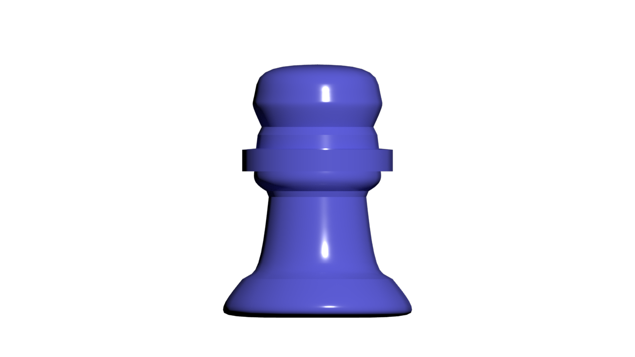
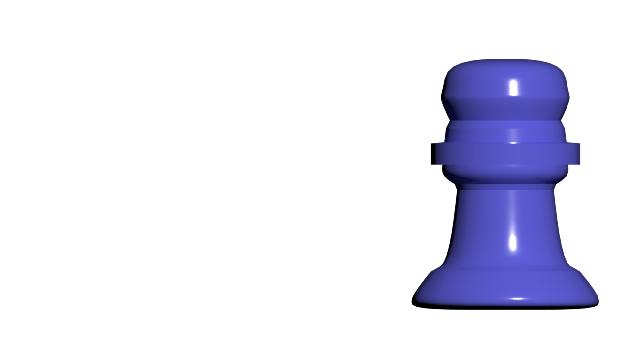
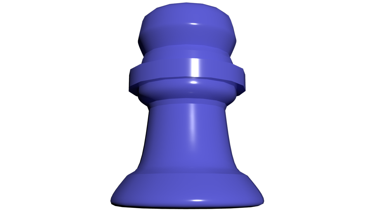
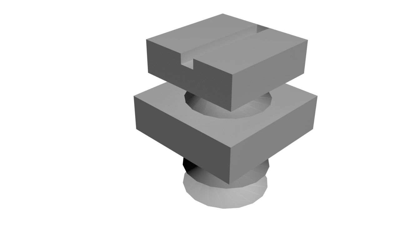
This was by far the hardest project we have done so far. I loved it in someways, but hated it in others, particularly the screw driver and the chess peice which we'll get to. The first one that I did was the screw driver. Not the easiest one but it was fun. In this one we messed around and utilized boolean, which I still find to be a funny name, especially for something on a computer. First of we used a cylinder, which was simple enough. But then we got to bending it with modifiers. I used one to make it go in a spiral shape. Mr.B Also wanted us to animate it and that is just what I didn. I made the screw go up and down. The wine glass was the easiest and also my favorite to do. All I needed to do was make an outline of what half the wine glass would look like then turn it into a 3d model,baddabing baddabang. Then comes "The Screwdriver." This, was, an, absolute, pain. I don't like to talk about it but I will do it for this post. We made it out of 1 cylinder. However we needed to use a spline and the loft mechanism. Using the loft feature alouded me to make different shapes and textures throughout the shape. First of all I got confused. When I wanted to make lets say... 80% of the shape a star, the 80 stood for the shape starts 80% of the way through. So yeah, that caused some, actually, a lot of trouble. The chesspeice was hard for me, but turned out to be actually easy. What made it better though was that Mr.B was playing Queen in the background which is undoubtably the best band, and no arguments can be made. Anyways, back to the chesspeice sadly. I had to trace the outside of the chesspeice and that's all. Overall this project had some ups and downs (*cough cough* screwdriver.) I enjoyed and hated it, but I did learn a lot from it such as splines and loft.